- You are here:
- Home »
- Blog »
- Articles »
- Simple Style Tweaks Your Readers Will Love You For

Simple Style Tweaks Your Readers Will Love You For
You’ve done it. You’ve written that killer story, or the zingy product copy to send to your client that will skyrocket their brand into the stratosphere. It’s spell-checked, proofread, and edited to perfection, with an eye-catching hero image in place. You’re quite rightly proud of your work.
Just attach and send, right?
Stop!
Pulitzer Prize-winning content it may be, but take a moment to consider the recipient’s reaction. That first impression when they open the document. It’s in your best interest to make it easy for them to read. Your extra attention to detail might help a client turn your work around faster or even be the difference between acceptance and rejection.
Sure, the content will be reformatted for publication by the client later, but your finished copy should shine in its own right. Considerate formatting is also beneficial for readers with additional needs, such as dyslexia.
To improve its impact, don’t look at your work with a writer’s or editor’s eye, but a designer’s. See if it delivers the right message and visually matches the story you’re telling. The design and layout should reinforce the style and tone you’ve used in the piece, as it affects the perception of your work.
If you don’t consider yourself a designer or know much about layout and fonts, don’t worry. These few simple tips will enable you to add visual punch to your copy.
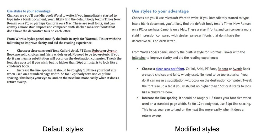
Use Styles to Your Advantage
Chances are you’ll use Microsoft Office or Google Docs to write. If you immediately begin typing into a blank document, you’ll likely find the default body text is Times New Roman on a PC, or perhaps Cambria on a Mac. These are serif fonts, and can convey a more staid impression compared with sleeker sans-serif fonts that don’t have the decorative tails on each letter.
Think of the content of your piece and try to match the font to reinforce its message. If you’re writing about a time gone by or a classic book review, a serif font is acceptable. For most other situations, sans serif is a better choice.
From Microsoft Word’s Styles panel, modify the built-in style for “Normal” in your document. Tinker with the following to improve clarity and aid the reading experience:
- Choose a clear sans-serif font. Calibri, Arial, PT Sans, Roboto, Helvetica, or Avenir Book are solid choices and, if sending your document in Word, fairly widely available. Choosing a common font means lower risk of substitution occuring on the destination computer. If you’re editing in Google Docs, any font is guaranteed to appear exactly as you see it. Tweak the font size up a tad if you wish, but no higher than 16pt or it starts to look like a children’s book.
- Increase the line spacing. It should be just under twice your font size when used on a standard page width. So for 12pt body text, use around 21pt line spacing. If you can’t use point sizes, a line spacing of 1.5 is great. This spacing helps your eye to land on the next line more easily.
- Set the paragraph spacing. The space after each paragraph should be between 1.5 and 2 times your font size. So for a 12pt font, use at least an 18pt space after. And set the space before to 0 so that any headings above a block of text appear closely associated with it.
- Use a dark gray font color. Stark black text on a white background is harsher on the eye and can cause readability issues such as blurry text, especially for people with dyslexia.
It’s also worth ensuring you set up your style so the body text is left justified (sometimes called ragged right). Although some authors prefer the neatness of fully justified text with its pleasing vertical lines on either side of the page, the varying gaps between words can create what’s known as the river effect. This is when larger word spaces line up above one another, causing a distracting river of whitespace to flow through a paragraph.
Studies have shown fully justified text is more difficult to read, and can be problematic for dyslexic readers who may lose their bearings while reading, so it’s better to design it out from the start.
Ensure Headings Are Consistently Applied

From seashells and Romanesco broccoli to facial features and spiral galaxies, many objects in nature around us obey the golden ratio. Although mathematical, based on the Fibonacci sequence of summing consecutive pairs of digits to form the next number, its interpretation appears baked into us. For example, studies have concluded that faces with features that exhibit the golden ratio are considered highly attractive.
You can use golden ratio principles to your advantage by employing techniques that website designers use to ensure content is readable and balanced and pleasing to the eye.
The simplest way is with this nifty calculator that helps you decide roughly what font sizes to apply to heading styles for the best reading experience. Plug in the values that you’ve chosen for your body text and set the content width to something like 600, the width of an average page of text.
Choose a value from the results that’s a step or two greater than your body text size, and apply that value to your Heading 3 style. Then apply the values above it in order, so Heading 2 is one step higher than Heading 3, and so on.
This perfect, balanced ratio between headings and body text will look great and convey a feeling of authority. Using a slightly different color or shade on headings compared to the body text will make your headings pop out and serve to break up the text.
Check Associativity in Paragraph Formatting
Next, turn your attention to the gaps between headings and the paragraphs above and below them. The general idea is to make sure that headings appear to be attached to—associated with—the paragraph below it.
When defining your heading styles, adjust their paragraph formatting so there’s a larger space above and comparatively little space below. Use the same line spacing as you applied to your body text.
If the space above and below is identical or roughly the same, the eye isn’t quite sure to which paragraph the heading is associated, or if it’s a pull quote. That can be enough to slow a reader down a fraction, which is something you don’t want.
Avoid Inline Styling If You Can

When you use bold or italics from the formatting toolbar, Microsoft Word creates a bunch of disparate inline style rules on your behalf.
It tries to be clever to minimize the number of style names, but can result in odd formatting quirks depending on whether you highlight regular text, a heading, a bulleted list, or a caption, and whether you select the spaces, punctuation, or hidden paragraph markers on either side of styled words. That leads to frustration when you want to make changes. Plus, you might miss some.
Instead, use styles. Word ships with two handy ones: “Emphasis” and “Strong” for italic and bold text. Simply highlight the text you want to affect as usual, and click the appropriate style from the sidebar panel to apply it. If there isn’t a style to match your needs—maybe you want italic and bold together—create a new one from the Styles panel, either by copying a style that closely matches your intended style, or clicking the “New Style” button and building it from scratch.
Using styles means if you want to make a formatting change later, you can just alter the style once. With that one change, everywhere that style is used throughout the document will update instantly, maintaining a consistent feel without you having to check them all one by one.
Google Docs doesn’t currently permit you to create your own new styles, only edit the predefined ones, so you must use the regular formatting toolbar for marking up inline content, such as bold, italic, and font adjustments.
Check the Visual Balance
Finally, test the “weight” of your complete piece by looking at its overall shape. The easiest way to check document balance is to switch your word processor to multi-page view and zoom out the document a little so you can see two, three, or maybe even four pages at once on-screen.
Stand up, take a step or two away from the screen, and look at the balance of the writing and white space. You’re looking for any blocks that appear heavier than those on neighboring pages. Perhaps one section has eight paragraphs while most others have three or four. Consider splitting that larger section into two smaller sections so there’s more harmony.
Viewing the document this way, from afar and zoomed out, means you aren’t focused on the words and are considering the shape of the entire piece, or as much of it as you can see at once.
If images are used to break up the text or illustrate a point, check that they are consistently applied or follow a pleasing pattern. Maybe alternate left to right. Use styles to help.
Ensuring the document has an agreeable flow equates to a more seamless reading experience, and adds a more professional edge.
Save a Template for a Quick Start

Don’t start from scratch each time. There’s no need to let your configuration work go to waste. Save everything as a template for faster recall next time.
When you’re done with your masterpiece, prepare a template by selecting all the content and deleting it. Then use the “Save As” menu option and select the “type” as Template. For Microsoft Word, this action will result in a .dotx file.
When starting a new document, you can open this template and immediately get on with the process of writing, knowing that your styles are already set up, available to be applied consistently.
Online collaboration environments such as Google Docs don’t work this way, but you can still download a document with all your styles in it, empty it, and store it on your computer. When you create a new piece of writing, just start a new online blank document and use File->Open to upload one of your templates as a basis.
Now Send It Away
Once you’ve set consistent font styles, line height, and paragraph rules, and have checked for visual balance throughout, it’s time to send off your hard work and deliver that all-important first impression to your readers.
You can be confident that it now looks better than work from writers who used the defaults. With just a few consistently applied stylistic tweaks that you can reuse, and by looking at your document from a distance, you’ve improved its visual appeal and readability to deliver a more enjoyable experience. And a good impression means happier clients, happier editors, and a greater chance of a favorable response to your carefully chosen words.
Go wow ‘em.
About the Author Stef Dawson
"With no formal qualifications in writing beyond night school, Stef is one of those annoying people who improves his craft by practising. A lot. Mainly because he loves finding better ways to do stuff. After oozing 1s and 0s for over a decade in web design and coding, he's officially turned his attention to content marketing and writing, with the aim of helping small businesses find and present their voice. His cats love assisting with this endeavour by padding across the keyboard to add their unique perspectuqwsdcvfoiu mn,olp.;mm."